
Gorillaz - Demon Days
The digipak for this album is very unique in the way it has been constructed, as it is presented in a folded up piece of cardboard rather than in a conventional CD sleeve. This is likely to be of further interest to CD collectors who weren't previously fans of the band, as they will look to collect this unique album sleeve.
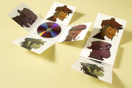
In terms of the graphic design, each of the sides of the digipak shows a different "member" of the virtual band. This is commonly used on the interior of digipaks in order to promote more of a star image for each of the band members, especially if the record label believes they are a band who's attractiveness will help them to promote the record. In addition to this, each of the four unfoldable parts of the digipak represent a quarter of the album cover, as these are the pictures which they are made up from. This also keeps the design of the digipak very uncomplicated, as there is no writing or other imagery, allowing the person looking at it to focus more on the album cover itself.
By using white as the predominant background colour of the inside of the digipak, the album sleeve has connotations of openness. This relates well to the music of the album, as it takes influences from all sorts of genres including hip-hop, indie and dance. The dark blue colour background colour of the album sleeve connotes power and seriousness, so has perhaps been used ironically considering the band is actually a project made up of cartoons.

Rihanna - Talk That Talk
The most immediately striking thing about this digipak is the use of an almost completely black and white colour scheme, with only a tiny bit of red text being used in order to make it stand out amongst the monochrome of the rest of the album. The use of black and white doesn't particularly make the album stand out to potential purchasers, meaning that the record company will have to rely on other promotion such as music videos and magazine adverts in order to promote the album.
In terms of design, the interior of the album and the CD are both designed to reflect the look of a newspaper - this is probably a reference to the name of the album being "Talk That Talk". The "talk" in question could be rumours about the artist which have been published in newspapers, so this design is probably trying to reflect that. It is also well matched, as the CD is the only part which is explicitly clear as being designed like a newspaper than the rest of the digipak, which makes it stand out from the rest.
There are 4 separate images of the artist within the digipak, which shows that a lot of the albums marketing is being based around the 'attractiveness' of Rihanna, as in all four of the parts of the digipak, there is no image other than that of Rihanna herself. This is probably due to the fact that she is young and female, which means that her music is likely to sell a lot better if it is marketed around her face.
By studying these two vastly different digipaks, I have found that it is best to stick to one theme throughout the entire digipak, in the interest of creating continuity throughout it. This continuity will then extend to the magazine advert and music video, in order to create a promotional package which looks like everything has been designed by the same team with the same resources.
No comments:
Post a Comment